
Tips and advice on selecting the perfect color palette to enhance your space.
The bedroom – our haven for rest, relaxation, and rejuvenation. But a space meant to inspire tranquility can quickly turn chaotic if the color scheme throws things off balance. This guide delves into the world of color, equipping you with the knowledge and tips to choose the perfect color palette for your bedroom walls, transforming your space into a sanctuary that reflects your unique style and fosters restful nights.
Step 1: Know Thyself – Unearthing Your Needs and Desires
Before diving headfirst into a sea of color swatches, take a moment for introspection. How do you envision your ideal bedroom?
- Tranquility and Peace: For a sleep-promoting environment, consider cool colors like calming blues, soothing greens, and restful lavenders. These hues have a natural ability to evoke feelings of peace and serenity, perfect for unwinding after a long day.
- Energy and Stimulation: Do you crave a space that invigorates you in the morning? Explore warmer colors like sunshine yellows, energizing oranges, or light corals. These create a sense of warmth and positive energy, ideal for those who need a little pick-me-up to start the day.
- Luxury and Sophistication: For a touch of elegance, delve into richer jewel tones like emerald green, deep sapphire blue, or even a luxurious plum. These colors create a sense of drama and sophistication, perfect for those who want their bedroom to feel like a luxurious retreat.
Step 2: Size Matters – Considering the Dimensions of Your Domain
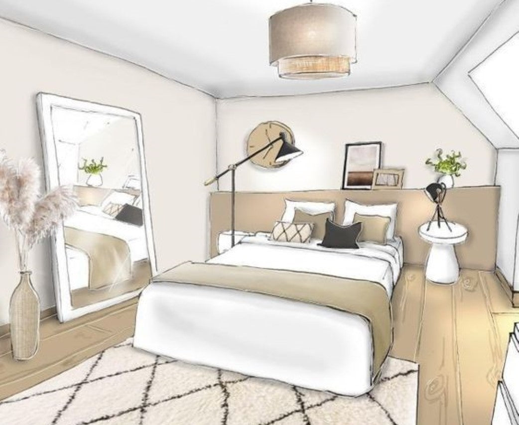
Just like a well-chosen outfit, the size of your bedroom plays a crucial role in color selection. Lighter colors like whites, pale blues, and soft yellows can make a small space feel more open and airy, allowing you to breathe freely. Conversely, darker colors like deep blues, sophisticated grays, or even a rich chocolate brown can create a sense of intimacy and coziness in a larger bedroom, making it feel like a warm embrace.
Step 3: The Power of Light – Harnessing Natural and Artificial Illumination
Natural light plays a significant role in how colors appear in your haven. Rooms bathed in ample natural light can handle bolder color choices, while rooms with limited natural light might benefit from lighter and brighter hues.
Don't underestimate the power of artificial lighting either. Consider the type of bulbs you use – warm white bulbs create a cozy ambiance and can enhance the warmth of a color scheme, while cool white bulbs can make a space feel more energizing and might be preferable for balancing cooler colors.
Step 4: Embrace the Symphony – Coordinating with Existing Elements
Your color scheme shouldn't exist in a color vacuum! Consider the existing elements in your bedroom – furniture, bedding, artwork, and flooring – as your supporting instruments. Choose a color palette that complements these elements, creating a cohesive and visually appealing symphony.
- Neutrals as a Base: If your furniture and flooring lean towards neutral tones, you have more freedom to explore bolder color choices on the walls, allowing them to take center stage.
- Matching or Contrasting? For a harmonious look, select colors that share similar tones or hues, creating a sense of unity. For a more dynamic feel, consider complementary colors that sit opposite each other on the color wheel. Imagine a vibrant blue wall paired with pops of orange accents, creating a lively and stimulating contrast.
Step 5: The Rule of Three – Crafting a Balanced Palette
Interior designers often follow the rule of three when creating color schemes. This means using three main colors throughout a space, ensuring a harmonious and balanced composition.
- Dominant Color (60%): This is the primary color that covers the majority of the space, typically the wall paint. It sets the overall mood and atmosphere of the room.
- Secondary Color (30%): This is a complementary color used in a lesser amount, often seen in furniture or bedding. It supports the dominant color and adds depth to the space.
- Accent Color (10%): This is a pop of color used sparingly in throw pillows, artwork, or decorative accents. It adds a touch of personality and visual interest.
Bonus Tip: Embrace the Power of Samples!
Don't rely solely on digital swatches or tiny paint chips. Invest in sample pots and paint a small section of your wall in different color options. Observe how the color interacts with the natural and artificial light throughout the day. This allows you to make a more informed decision before committing to a full room color.
“Remember, your bedroom is your personal sanctuary. By following these tips and considering your needs and preferences, you can choose the perfect color.”

Leave a comment
This site is protected by hCaptcha and the hCaptcha Privacy Policy and Terms of Service apply.